We started concepting for Krash Kourse with one very simple idea in mind: people who Love K-Pop love it in a way that is not like the way we experience love.
We may love our families, our pets, our nation, our Sega Genesis. All of these emotional attachments are small and inconsequential in the face of a K-Pop stan. They are the most demanding fandom on planet Earth. They cannot be reasoned with. They cannot be stopped. So, we had better make them a good looking show.

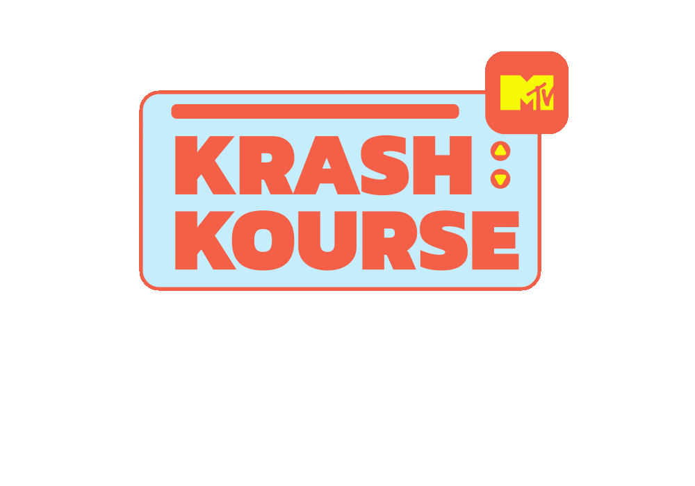
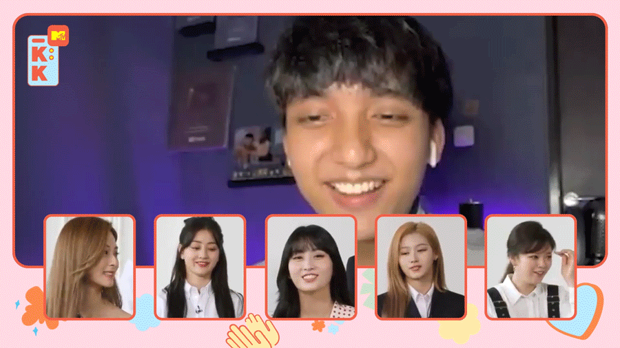
What we wanted to create for Krash Kourse was something that was visually striking, while still being immediately recognizable to people who love Korean culture.
K-Pop has an established aesthetic, and our hope was to work within that aesthetic rather to reinvent the wheel.
What we landed on can be seen below. The most noticeable element of most Korean hallyu media is that visual elements accent and emphasize the talent and the action of the show rather than seek to be visually dominant.


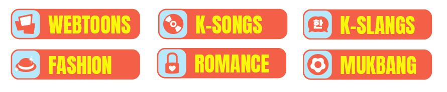
You cannot be iconic without icons.
So we made some icons to explain each of the focuses of the show. Whether it is how you dress, what you listen to, who you love, or what you eat, there is a way to do it with massive K-Pop verve. We don’t have that, in our personal lives. The verve, we mean. Honestly, this show is probably going to fix many of our personal failings.


A TOTAL TRANSITIONAL TRANSFORMATION!
When you’ve got show segments, you need a way to gracefully segway between them. Unless you’re just going to shout ‘this part is over, we’re doing something new now’. Honestly, that’s not a terrible idea. Please commission us to create that. Just a show of shouting and segment transitions. Until then, please enjoy the lovely ones we made for Krash Kourse.


