This rebranding marks a new Update Status era where we focused more on MSM instead of both MSM and FSW. This shift of focus is reflected by a new wave of changes; from design, colors, visual direction, and user experience on our site.
To create comprehensible content that encourages our audience to check their sexual health status or maintain it, we designed a set of Brand Messaging Pillars and Verbal Tone to help reach that cause. The Pillars are: Maintain Status, Update Story, Update Status, and Other Updates. Meanwhile, the Verbal Tone aimed to educate without condescending and underestimating the audience.


Since most of our back-and-forth communication with our audience happened via text, our writing tone could determine our existence. Hence, we utilize a casual, witty, easy-to-understand, and entertaining way of typing. This way, we can give the audience the information or answer they need without seeming condescending or annoying. In short, we can relay information provided by our consulting doctor packed with medical terms without confusing our audience or reducing its message.

Update Status logo is designed to be a simple wordmark created in any brand's official colors.
Its simplicity and flexibility represent stability, strength, and confidence as an anchor in cross-channel advertising and marketing expressions.

Logo construction

Clear space
This rebrand added several new, more diverse colors, such as Light Salmon, Medium Champagne, Cornflower Blue, Mulberry Crayola, and Electric Blue, to the previous three primary colors (Rich Black FOG, Tart Orange, and Light Goldenrod Yellow).

Color Palette
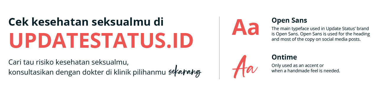
Typefaces
In terms of illustration, supergraphic icons, and scribbles, we focused on simple geometric shapes where the characters and objects aren't too detailed to prevent them from making the overall design over-complicated. In general, this new visual direction aims to create fresher, friendlier, and more fun content for the audience without diminishing the educative and informative points.


Our supergraphic icons symbolize our brand messaging pillars. They are designed with several key object elements best to represent each pillar for our audience's understanding.

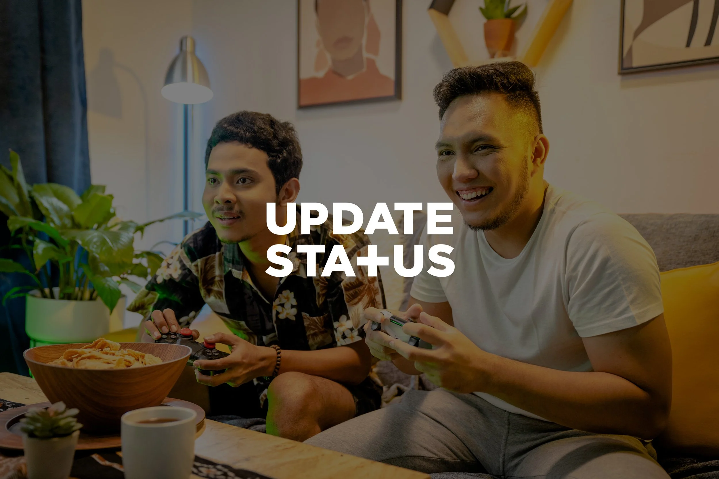
While our source of photos could be varied, such as for photoshoots and online stock photos, we are always consistent in their grading treatment. We try to convey color tones that bring hope, fun, and a bright vibe for the audience.


For motion graphics,
our idea of simplicity still stands.
Both our characters' art direction and movement are designed to be not too realistic and complicated. We don't shy away from using silhouette characters for medical and technical-focused content. We will still use a character with facial expression if the content is centred in storytelling with a clear subject.
Since most of our content goes live on our social media, having a clear guide on looking is an important part. That's why we incorporate text, photography, supergraphics, and patterns in different ways throughout the campaign to add visual diversity while keeping the brand identity strong, clear, and cohesive. In addition, social media posts have their pre-made templates, with detailed guides regarding which part of the image should contain which asset or information.


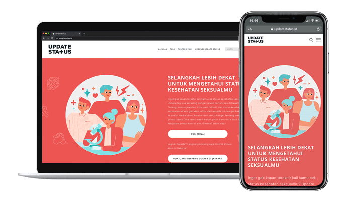
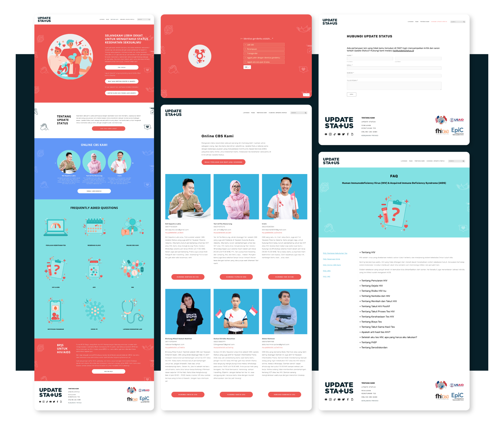
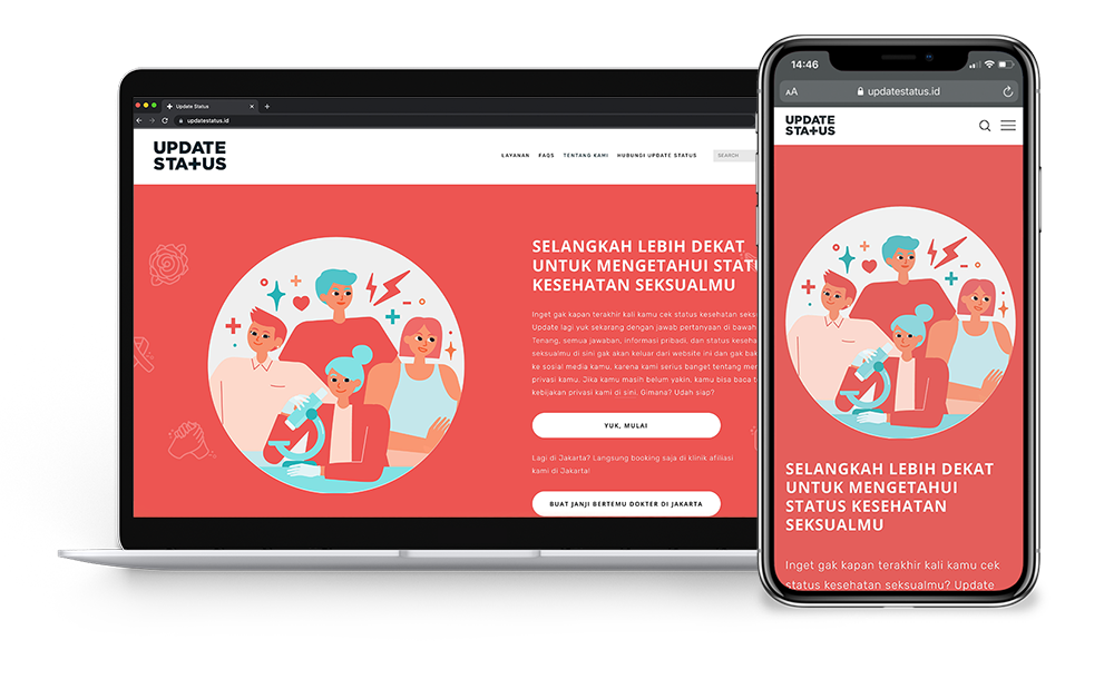
As a reflection of the big rebranding that happened throughout this project, updating the website's visual into the latest design and vibe is inevitably essential. We incorporated the new colors and designs, cleaned the layout, improved the UI & UX, and added the CBS profiles to ensure the best user journey and maximum help our audience can get.
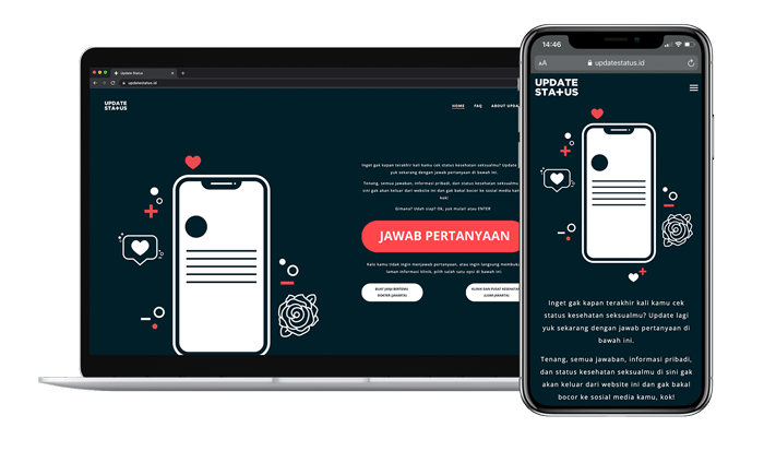
updatestatus.id before the makeover
updatestatus.id after the makeover